TRANQUIL BANK APP
Crafting a Trustworthy and Playful User Interface for a Responsive Banking Application
Professional Certificate in UI Design

TRANQUIL BANK APP
Introduction
I designed a responsive banking app for a dynamic challenger brand in finance, aiming for intuitive use and user trust.
Understanding the Brand Tone
I delved into the client's brand principles: Playful, Clear, and Trustworthy. Balancing personality with clarity, I infused colour, animation, and shape, ensuring intuitive design while maintaining trust.
Responsive Design Across Platforms
I ensured responsiveness across desktop, tablet, and mobile platforms, adapting playful elements to various screen sizes using wireframes as a guide for consistency.
Playful Elements
I employed vibrant colours, animations, and shapes strategically to create engagement and guide users intuitively through the app.
Clear and Intuitive Information Presentation
Prioritising clarity and logic, I designed an uncluttered interface, meticulously crafting every element for seamless navigation and user comprehension, considering the sensitivity of financial dealings.
Instilling Trust
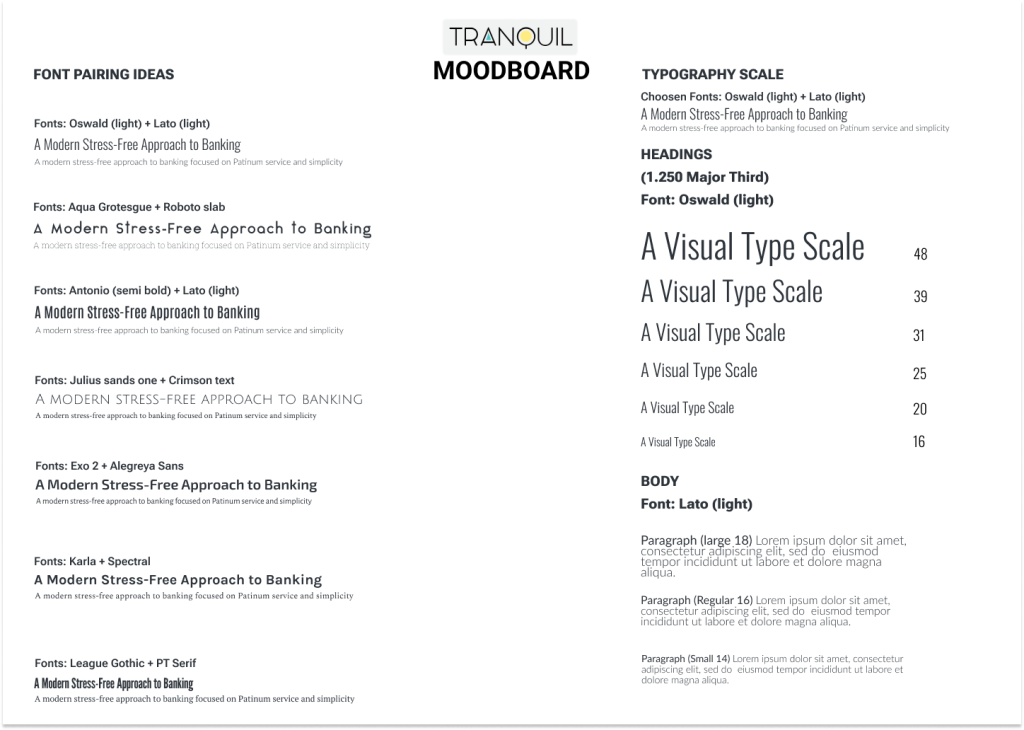
To meet the paramount requirement of instilling trust, I focused on creating a design that exuded reliability and security. From the choice of typography to the imagery used, every aspect of the UI was carefully curated to reinforce a sense of trustworthiness. Transparent and straightforward communication further played a crucial role in building user confidence in the application
Conclusion
Through the careful integration of playfulness, clarity, and trustworthiness, my journey in designing the UI for this responsive banking application aimed not only to meet but exceed the client's expectations. The resulting cohesive design not only stands as a testament to the brand's unique personality but also ensures that users have a delightful, clear, and secure experience while managing their finances.
TRANQUIL BANK APP


